I've been working in #ArtDirection
for many years and it does feature a lot of things, but my favorite
have always been EVENTS, CONFERENCES, TRADE FAIRS... SO here am I
specializing into it! Watch this video to know more & follow MM corporate on facebook & insta !
It's not the first time I talk about it, but this concept is still successful years on: Havas have created for Monoprix a systematic packaging that is everything but boring! Watch the video for more and don't forget to read the labels next time you shop there ;-D
This campaign has been so overwhelming, and with so many highlights that I don't know where to start!!
Samoa Cosmetics has been on the Lebanese market for 40 years!
I discovered it when i was a kid in my mom's vanity, and was always amused by the image of the samoa woman, confident and cheeky at the same time... Then the years passed and somehow it was always part of the scenery, but in a more demure way.
Therefore i was more than excited when Samoa reached out to me for the #Samoa40andFAB campaign!
So i unleashed my glitter and sparkles and had fun all the way!!
Creating the image of the campaign and the whole set of packaging...
Collaborating with Joe for the online strategy, we sent 40 countdown gifts with a daily personalized message to beauty and fashion bloggers across the country, and i loved playing Mr Darcy !
We also added a Style page to the Samoa Website, where you can check the latest trends and how to match them with your makeup:
And the official campaign launch happened at Memory Lane, where we had even more fun than our guests:
The next surprise is a blogger collab for the holiday season, but I will not reveal it now: keep following Samoa's insta and fb for more. Also, make sure to share your favorite product with the #Samoa40andFAB hashtag for a chance to win the fabulous collector box or even the FAB PARIS TRIP!!
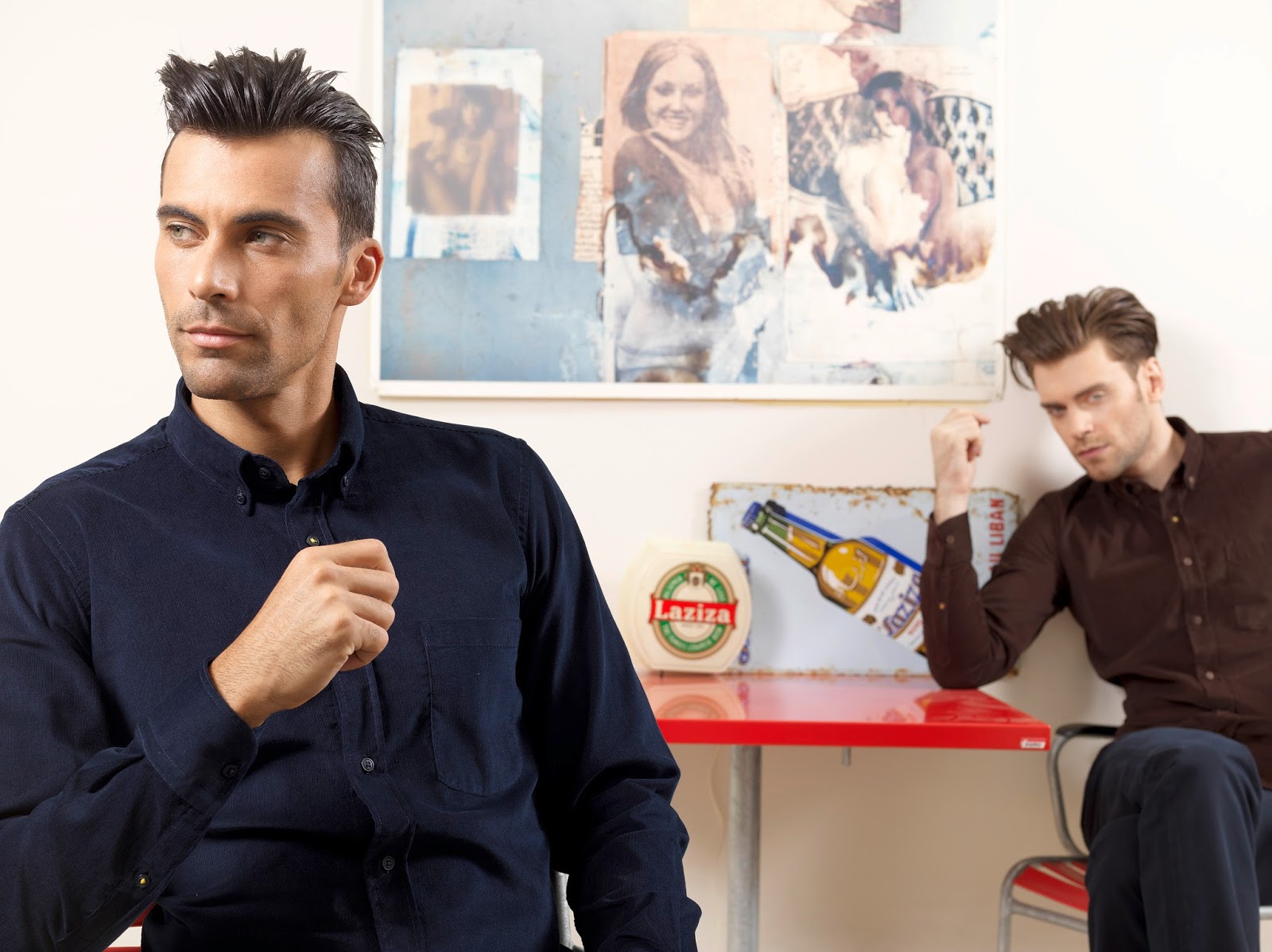
Here it is!!! Our latest work for the JAUNE campaign!
With huge thanks to Chasper Sarott, who welcomed us in his unique flat. It was a pleasure to shoot between those exclusive artworks...
And a round of applause also for Tarek Chemaly who collaborated with us on many levels this season; his pop collages were the perfect setting for the fall winter collection:
You can check the full catalogue here, or simply let yourself immerse in our mood with this short clip:
Cheers to the dream team: Imad, Joe, Tania, Ghina, Bechara, Carole, Gheith, Daniel... and myself, creative director ;-)
I know I always shared sneak peeks of my work before they went public but this time, given the ultra confidentiality i could not. I waited for the shops to open and the look book to be sent! But now we can share it with the world:-)
As you know, Rectangle Jaune has been on the market for 28 years, strong with their high end quality DNA, they shifted to a smaller name, JAUNE, in order to reach more and go global. To embrace their new design motto "Less is more", we decided to remove the pocket label and use only the yellow threads on the second button as signature:
Fun, right? Also we brainstormed for weeks for the best concept to explain this uplifting and came up with these films, created by myself, directed by Ghassan Koteit and produced by The Filmhouse :
In a nutshell, we are saying that while we are proud of our heritage, "change is the only constant"! So we simplified our approach to be more minimalist and enhance our essential qualities, which is in the current Zeitgeist...
Above a picture from the TRENDS wardrobe: new structures and patterns, with closer cuts.
On the blue background, a picture from the ICONS classic wardrobe.
And this last one is from the ACTIVE palette, with bold colors and nautical themes.
To celebrate the new branding and to present the collections into their perfect setting, BLEU design renovated our flagship boutiques. The elegant mix of rough wood and dark steel with bright yellow convey an atmosphere of boldness & warmth, portraying perfectly the style codes of the modern gentleman.
As you see, rebranding a landmark is not an easy step and it involves every possible aspect; for instance the website Jaune.me developed by ActiveWeb follows the same "Less is More" spirit:
Which is also conveyed in the publication:
This barely sums up the works did in every field to boost this launch, but more reports and posts are coming very soon so stay tuned!
~M
Still trying to catch the name of agency & director but here we go:
to celebrate spring, mothers' day, my 9 years of blogging (!!),
I GREET YOU WITH WHAT A REAL ADVERTISING SHOULD BE!!
Funny, fresh, not afraid to show the product in extreme situations, full of REAL people, people of all kinds, NOT THE PERFECT CLEAN FAMILY (that doesn't exist) EATING PERFECT PRODUCTS (that don't exist either). Coming from the country of "clean", It's so fun to see this "dirty" ad.
My husband who's a film director said : "someone got fired after this!", I think on the contrary someone got promoted :-)
Last month we visited Pitti Uomo in Firenze, and I wrote a post about the brands that caught our attention.
However the visual and gastronomic explosion that marked us forever was ~ DRUM ROLL~... IL MERCATO CENTRALE! (logo and identity by Almagreal, representing the central location of the mercato)
This Iron and Glass building was created in 1874 by Giuseppe Mengoni, who designed as well the famous Galleria Vittorio Emanuele in Milano. For its 140th birthday, Umberto Montano and Claudio Cardini gave this San Lorenzo Covered Market its glory, bringing people back to this vibrant city landmark, with traditional shops that give the artisans the center stage.
Following this idea, every booth is hosted by its star artisan, with his name and caricature illustration by Jonathan Calugi, who caught the character of each person so perfectly.
Here is a small animation by Simone Brillaleri of one artisan for example:
Amazing isn't it?
The food of course compeets by far with the most famous restaurants in Florence, not to mention that it's for a bargain! I had the best pasta and arancina tradizionale with a delicious Aperol Spritz, for around 20 euro...
I leave you now with a few pictures of the identity in the website, magazine, place etc...
Ecollo qua! Bravo a tutti, direttore, architetto, designer, animator, illustrator...good job!
Don't miss it if you're on a trip to Italy and i know a lot of you are planning to this summer... UPDATE!!! Thanks to this post I've just discovered that the talented Lebanese Stephanie Richa worked with Jonathan Calugi on the identity during her internship in Firenze! BRAVISSIMI!
I can't believe it's been three weeks we finished BIFEX, the yearly conference of LFA, Lebanese Franchise Association!
As usual, my job was to create this year's conference branding, all the animations that passed on the screen, as well as all the prints.
Concerning the closing Gala, the theme was the "Lebanese Pop & TV Culture" of the seventies.
Tonight I will be on #BalaToulSire - Future TV to talk about it, as Zaven is also very interested by this theme and is actually publishing a book about the subject!
Here are a few pictures; first the preparations of the giant TV screen:
The hundreds of TVs in the Deco...
The old soda bottles with carnations, the "in" flower at the time:
Having a laugh on the vintage TV set:
The Diffa Ladies, totally in the theme ;-)
Pierette Katrib, the perfect MC
Souad el Achi " As3ada allahou masakom..."
Allo hayété... Pierette and Mr Majzoub:
8eme Art performing Allo Hayété:
George Khabbaz paying a tribute to all the late stars...
Zaven & Rima Karaki with the 7up bottles ;-)
Chou batariytak? Vintage ads played by 8eme Art..
Yanasseeb dour w seeb... The real Lebanese Lottery Wheels!
After that, the awards started, and then we fired up the dance floor, in good LFA tradition...
Huge thanks to Mr Makdessi for the TL archives, IAA for the advertising archives, Rita Moussalem & her team who found solutions to produce all my ideas. Sultan Touma, Omar Youssef and all the Screen-Lighting-Audio-Video-Photo team, 8e Art for a wonderful performance, Bassam Abou Zeid, Rita & Jean Aoun, Joe Alam who made BIFEX a trending hashtag on social media this year...
We were about 50 people striving to make this event a success and it was even more. Thank you all!